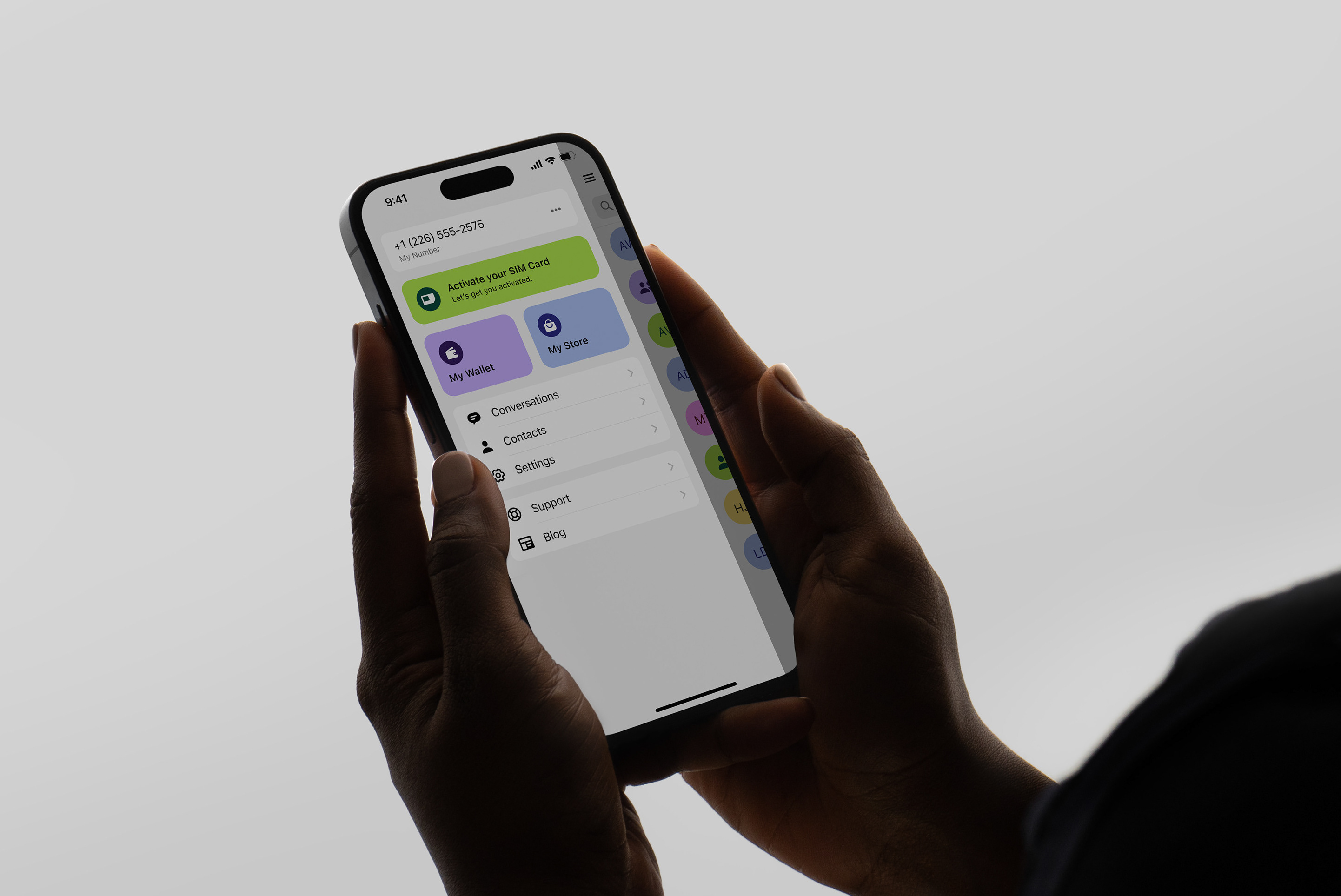


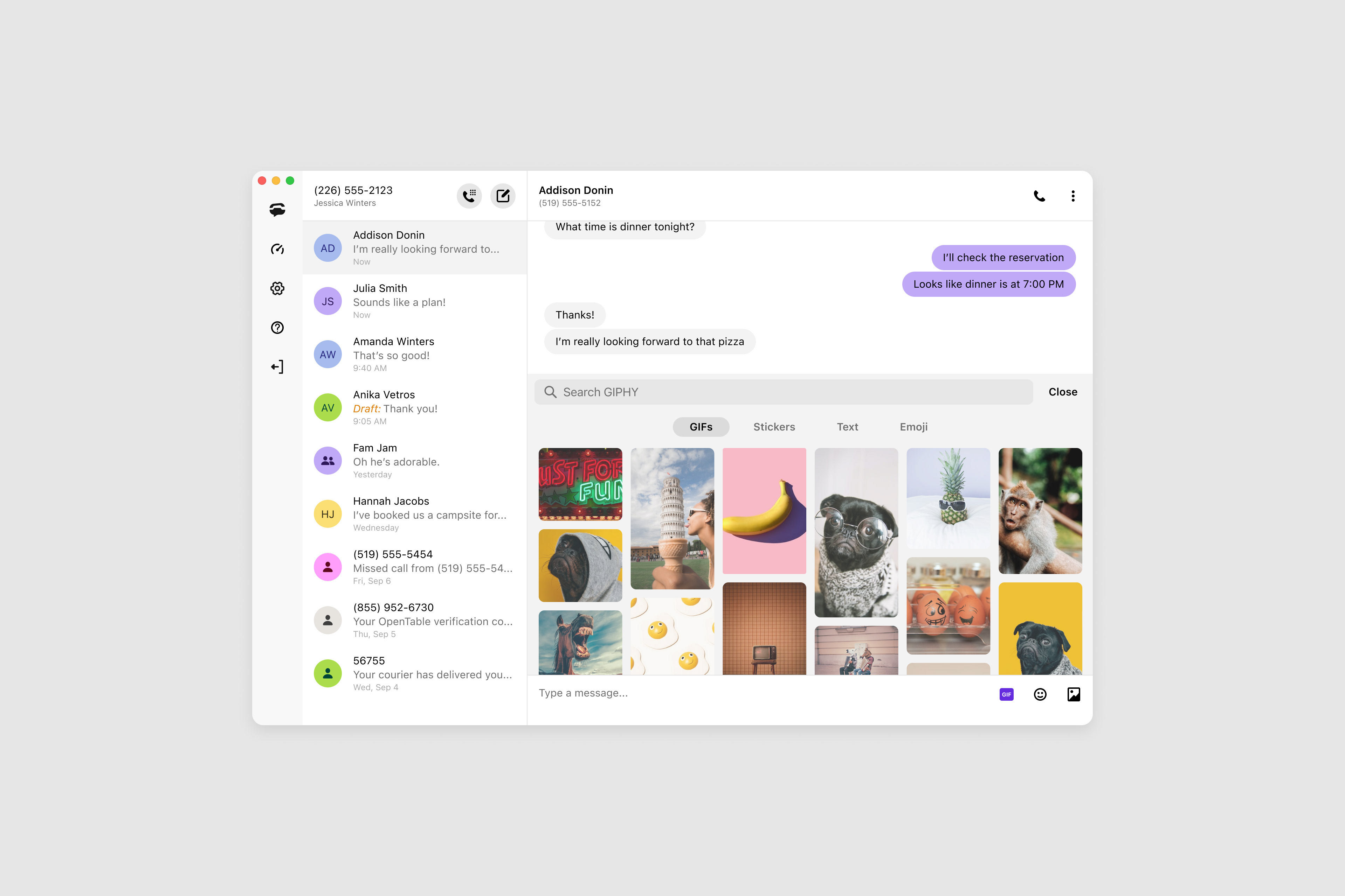


Our desktop messaging and calling app hadn’t been updated in years. It had a dense, inconsistent UI and lacked basic accessibility standards. It was missing some key feature elements found in our mobile apps and it didn’t reflect our evolving brand identity.
My role was to lead the UX/UI redesign to improve usability, visual clarity, and user efficiency—while aligning the interface with our evolving design system and accessibility standards.
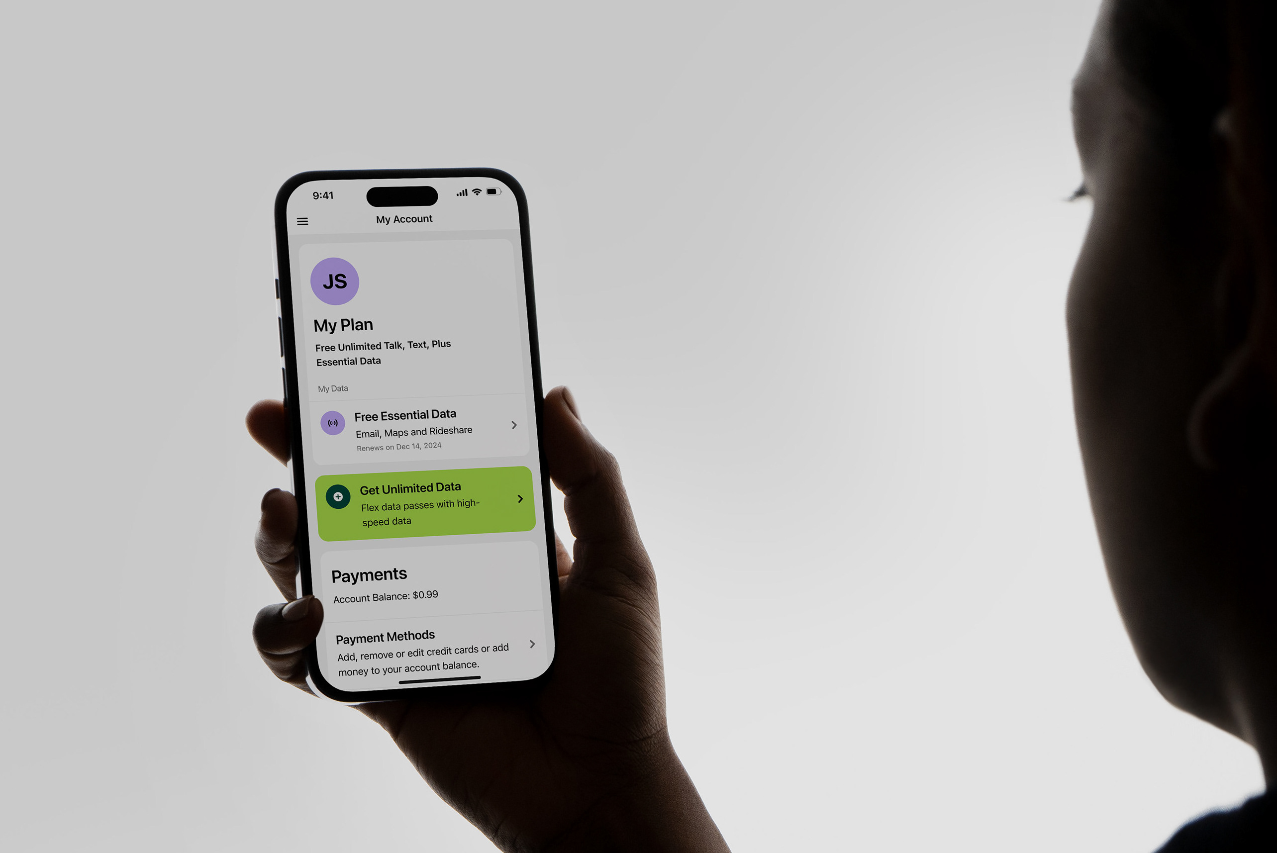
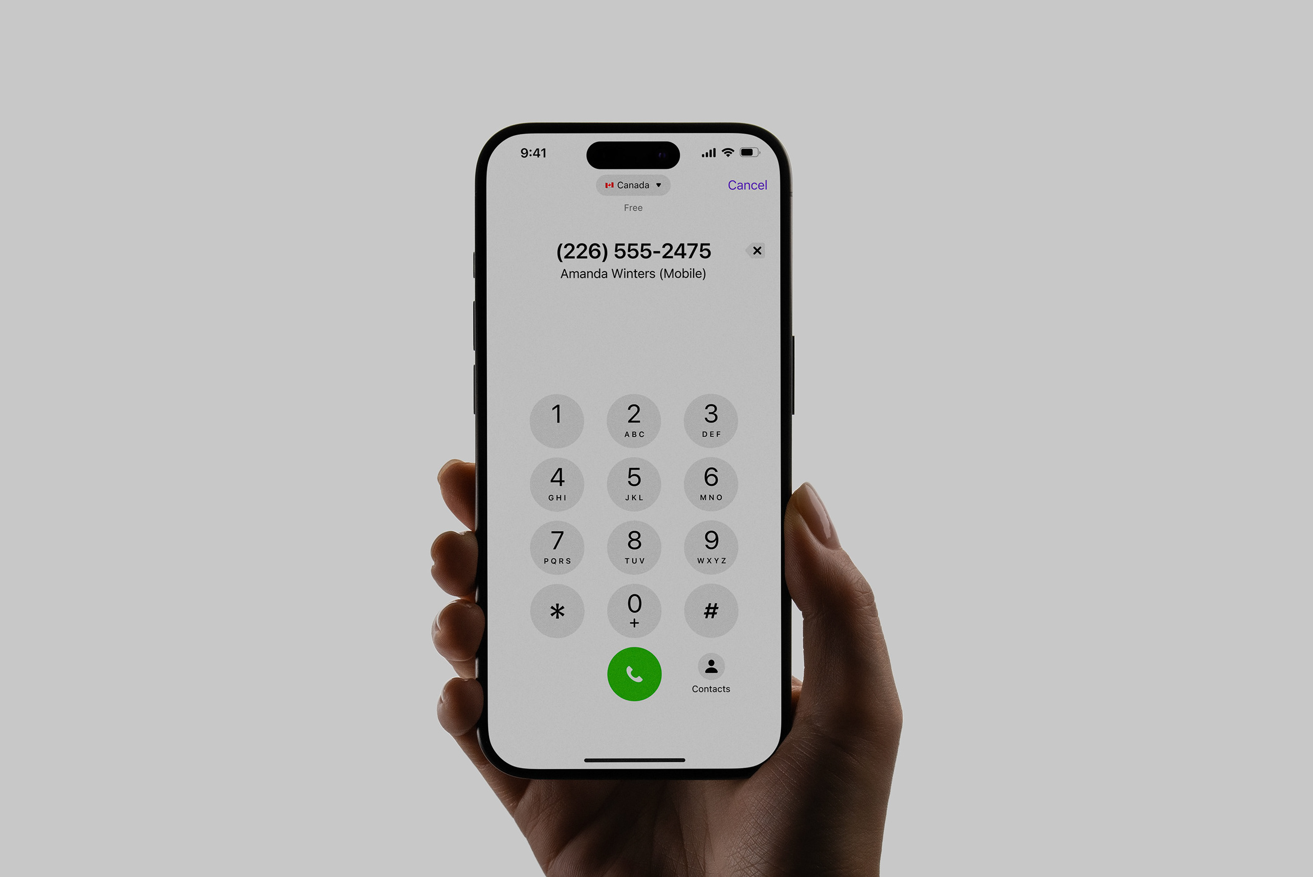
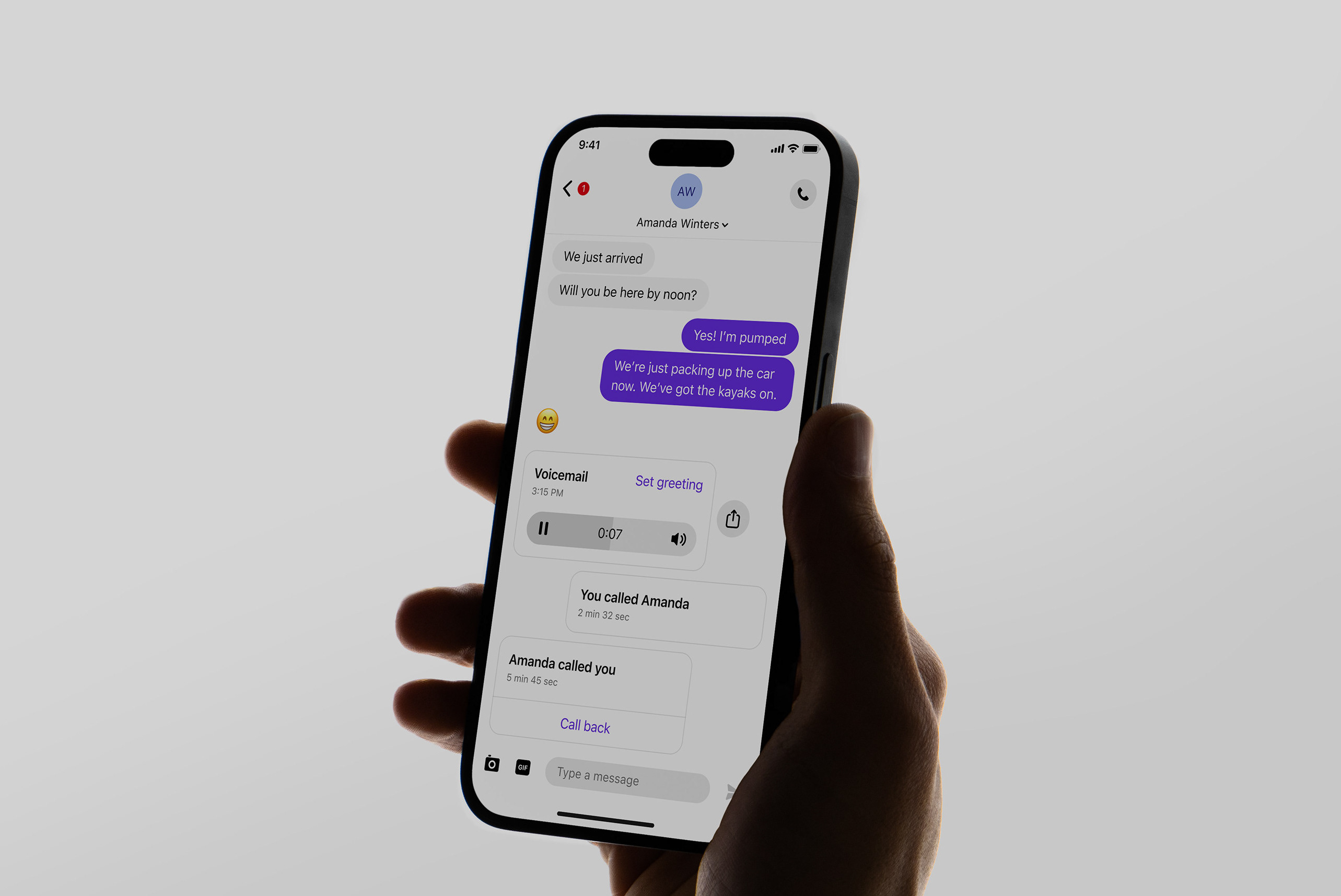
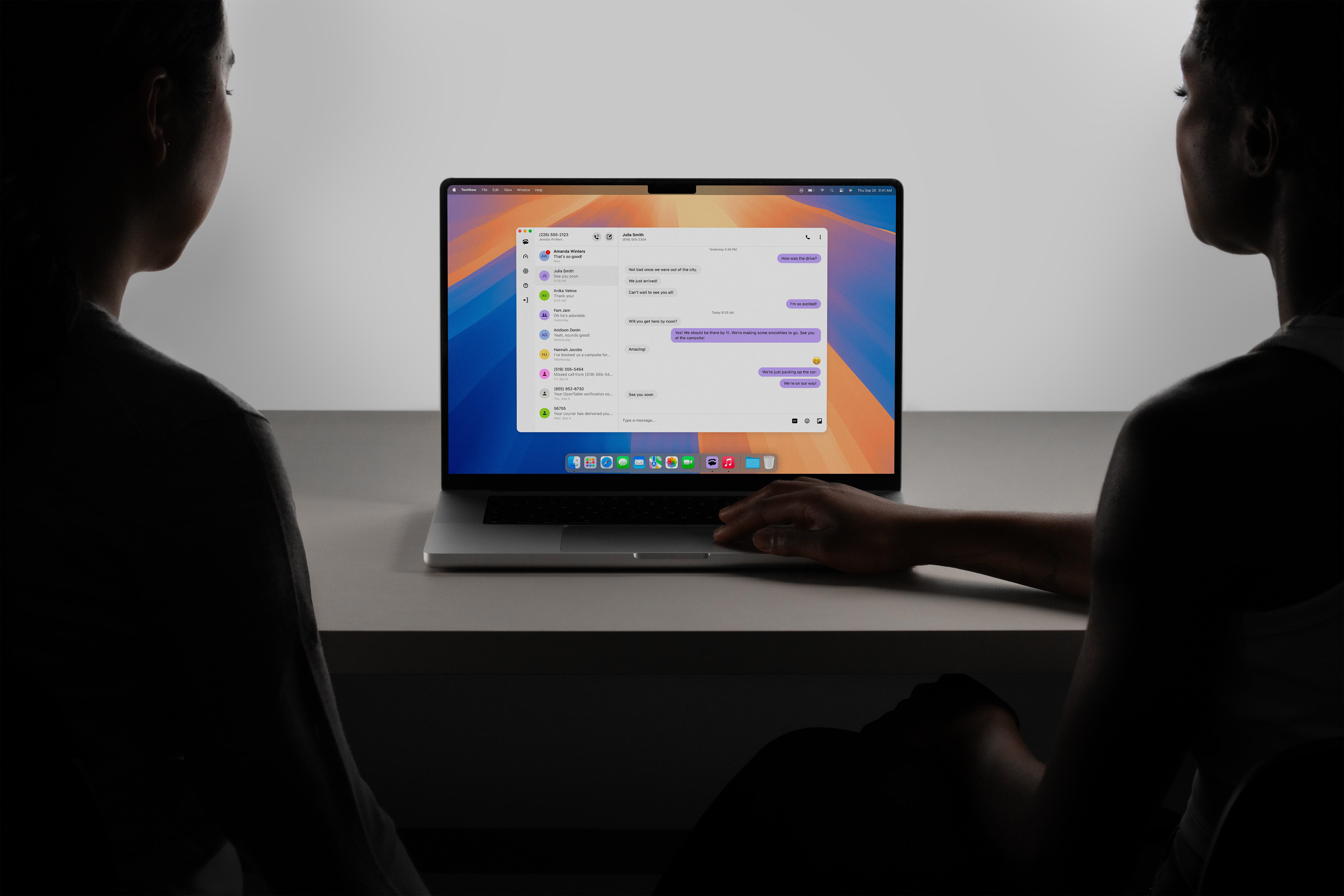
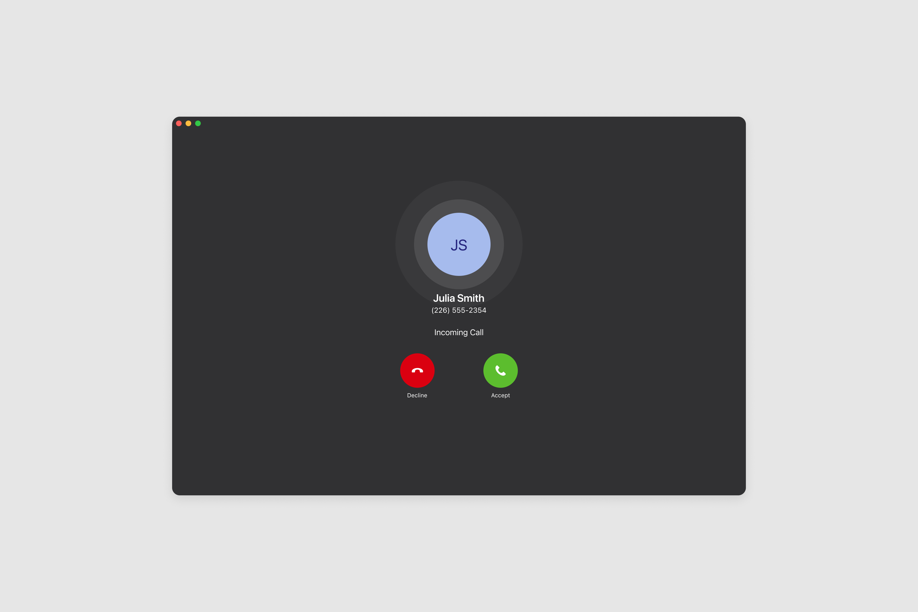
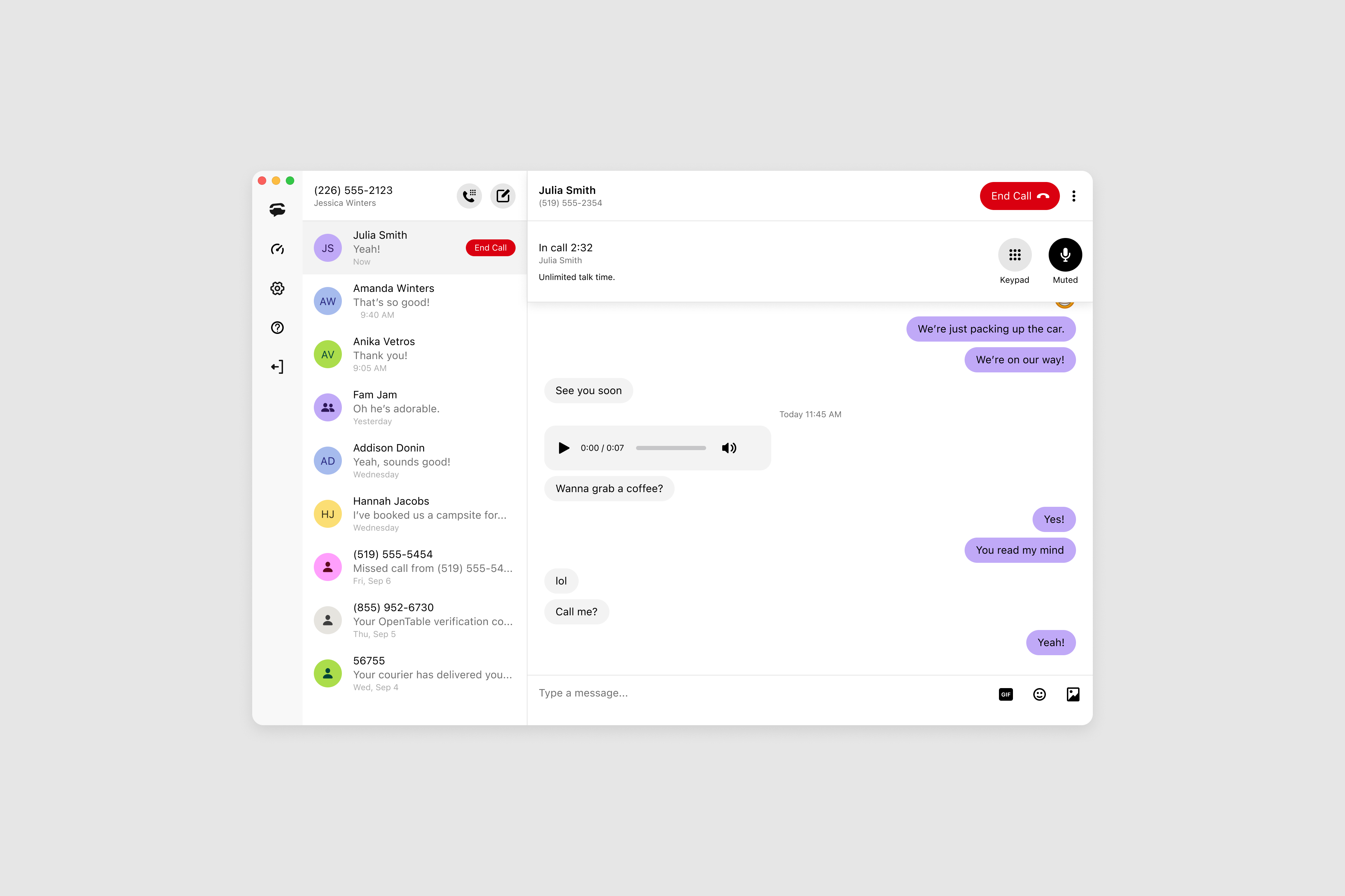
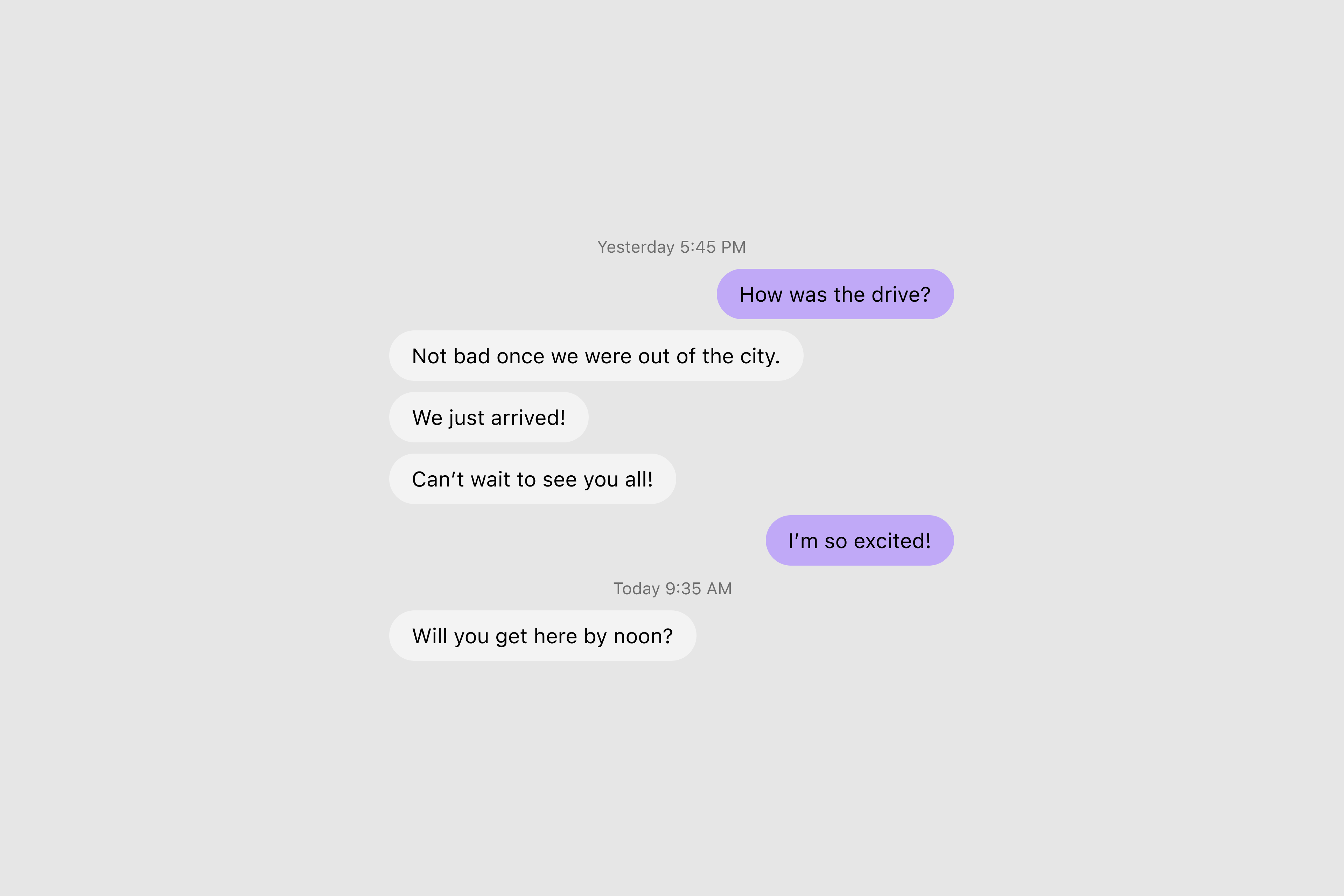
I started by conducting usability audits to understand core pain points. I explored several layout concepts and conducted prototype usability testing. I updated the attachment & message panel, enhanced the type scale hierarchy, introduced consistent time stamps and chat bubbles, added micro interactions to the calling experience, fixed broken windows in settings, and updated our brand aesthetics. I worked closely with engineering to break down the user stories and designs granularly, and we ensured performance wasn’t compromised by new components.
We transformed TextNow’s web-based text messaging and calling app into a sleek, modern communications hub. By fine-tuning every pixel and interaction, we made sure that sending a message or making a call feels as effortless as a conversation over coffee—smooth, simple, and satisfying. Post-launch qualitative feedback was positive. Users reported the app felt more modern, easier to navigate, and visually cohesive with our mobile app. The redesign was considered a strong step forward in modernizing the TextNow product experience.
Role: Product Designer
Deliverables: User interface, user experience, micro interactions, iconography, and design system foundations.